MARY CHAPP
Design & Illustration
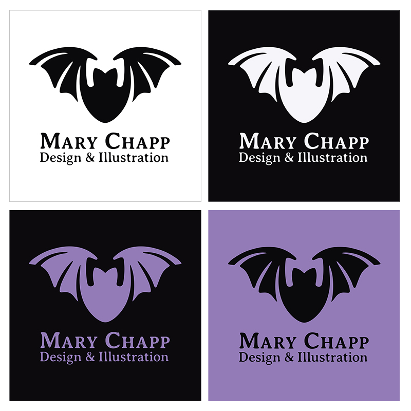
For most, bats are ugly, creepy and gross. Not to me though. This misunderstood creature was chosen to represent my personal brand for the positive symbolism it evokes. While some cultures and religions consider this flying mammal to be a harbringer of evil, Native Americans however, consider the bat to be exceptionally creative, spiritual and social animals. Bats are keenly observant of their surroundings using echolocation, sensitive to detail even in the darkest places, and highly communicative with members of their colony; all important elements that are present in graphic design. The added bonus is that they reflect my interest in the macabre and gothic subculture. My mark went through drastic changes over the years as I evolved as a designer. At the beginning, I wanted it to be my initials forming a crescent moon and bat. At times, the mark was too “goth,” or "spooky." I could see an “M” in the negative space of the bat, but the trick was to get it to work as a cohesive piece. I wanted to steer clear of pointy edges that would look like fangs. Rounded edges gave me a softer tone, something more inviting and neutral. Purple was chosen for its elegance and mystery.